


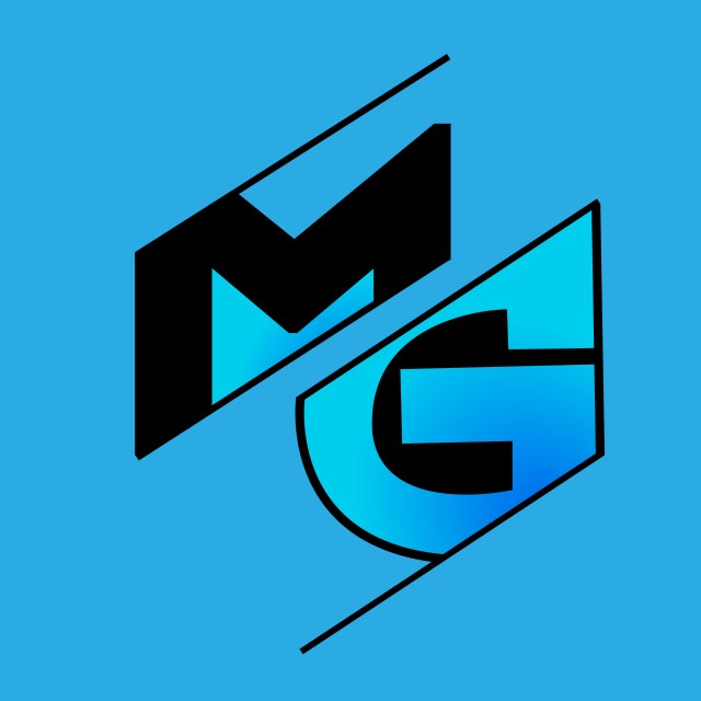
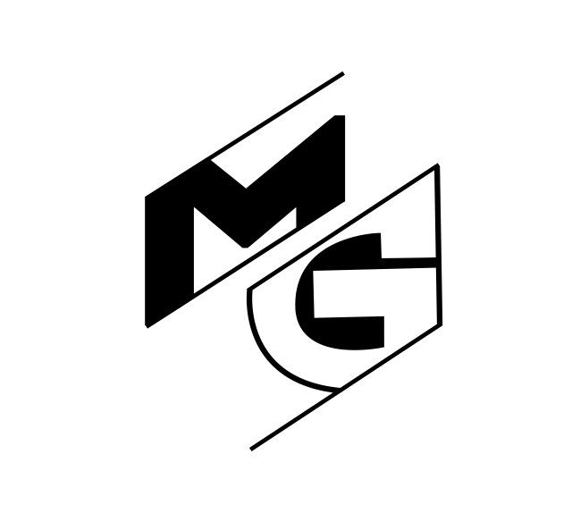

Monday Graphics is a fictional freelance graphic designer requesting a logo that highlights the use of lines and simplicity. The focal point of this project is the use of logo combination, which incorporates letter mark and wordmark logos and can be separated depending on the needs of the client, as shown below. A complete design style guide was created to provide color swatches, alternate versions, specific typography, and guidelines that instruct on how and when each logo should be used, depending on the canvas and colors.
Click here to see the full logo style guide.

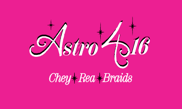
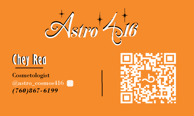
Astro 416 is the brand identity of a local cosmetologist specializing in hair braiding. This project consisted of logo creation, overall branding, and business card designs. With the brand colors consisting of pink, orange, black, and white, I created a logo in Adobe Illustrator where the design utilizes the A from “Astro” flipped and turned into the 4 from “416” which generated a cohesiveness throughout. The business cards were made using Adobe InDesign and showcase a style that is clean, professional, and concise. All files were exported in the correct file format for each job (SVG, JPG, PDF) and correct settings being RGB for screen use and CMYK for printing.
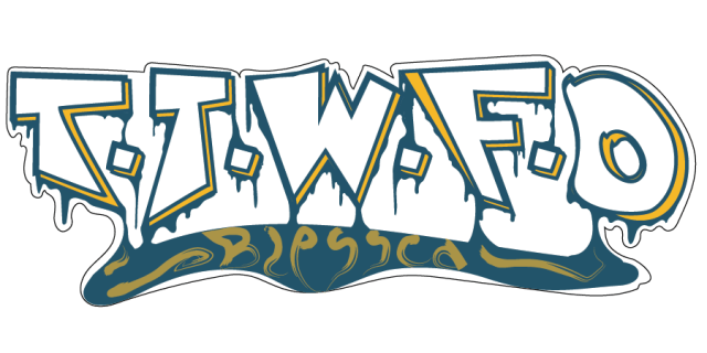
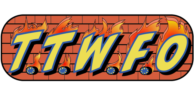
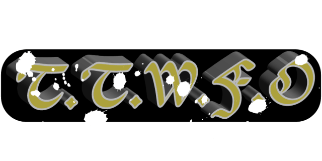
A local barber studio “Better Days” granted permission for a client to have their original logo customized for hat designs. In addition to modifying the logo, the client also requested varying designs of the acronym “T. T. W. F. O.” standing for “Till the Wheels Fall Off” to complement the newer versions of the logo. Given complete artistic freedom, I created four custom variations of the Better Days logo in fun, new color waves utilizing Photoshop and Adobe Illustrator. By not altering the logo to a point of distortion, I was able to stay true to the original.
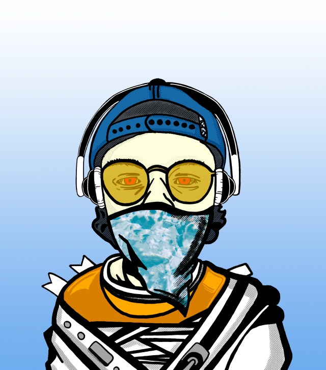
This project is an abstract self-portrait I created using Photoshop and Adobe Illustrator. It is the very first digital art piece that I created on my journey to develop my artistry and become a graphic designer. The portrait symbolizes the proverbial principle of the three wise monkeys: “See no evil, hear no evil, speak no evil”. However, my eyes are not covered to depict the evil in the world that I am helpless to see, while still attempting to not hear or speak evil.
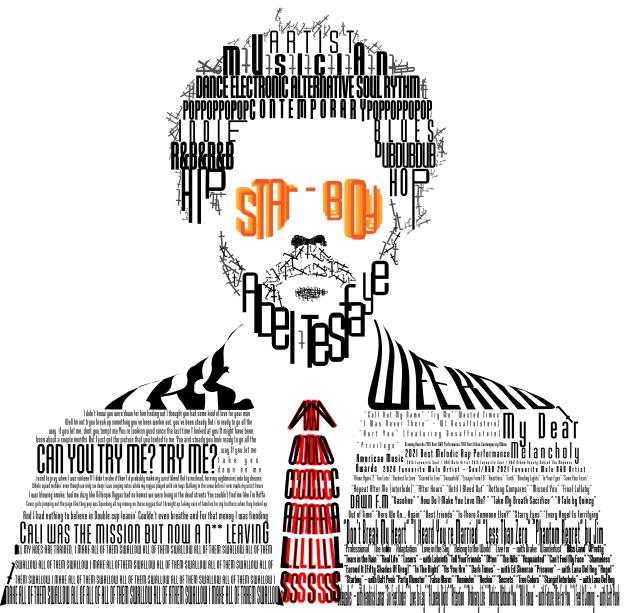
This is a typography portrait of the artist, musician Abel Tesafaye also known as The Weeknd. I chose to use the typeface “Baucher Gothic URW” to complete the illustration. This font resembles the artist because of its professional and gothic look. Although you might not think of gothic when you read the words “The Weeknd”, this is what the artist portrays in his visual branding and persona. The artist’s lyrics often refer to the night life and dawn as well, which gives the feel of full moons, bats, vampires, and black skies.
Baucher Gothic URW is a typeface published in 1995 by URW Type Foundry. Founded in 1972 by Gerhard Rubow, Rudolf Weber, and Peter Karow, URW pioneered digital typeface. Baucher Gothic URW is a sans-serif headline typeface with 12 fonts in its family. Its tall and geometric shape works well for narrow spaces and digital appearance.
The head is made up of words that describe the artist along with his real name as the beard. The body is made up of lyrics from his songs with the shoulders reading his stage name The Weeknd.

Don Felipe’s is a local food catering company that already had a logo. I was hired for logo update and branding help. The original logo was only in jpeg form making it very pixelated and not ideal for sticker prints. I vectorized this logo in SVG format as well as creating paper flyers, and a digital food menu for two televisions. The link below will take you to my social media page where the menu is posted on the left tv as the right tv plays a slideshow of multiple food items, partnered sponsors and catering services.

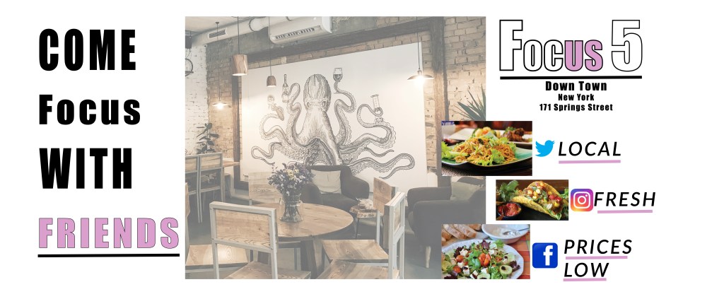
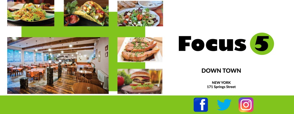
The fictional restaurant advertisements shown here were created with the intention of being displayed on subway walls to facilitate engagement with busy foot traffic in the area. These promotions were specifically generated for interaction with the targeted audience of millennials who enjoy traveling out of town for finer dining experiences. Utilization of QR code for ease of access, coupled with a simplistic design and minimal text, helps largely to attract interest and effortlessly explore more information about the restaurant. Both ads are individually unique, while still maintaining coordination and cohesiveness between the separate designs. The outcome of this project showcases my ability to be versatile in creation, while catering to the client’s desired outcomes.


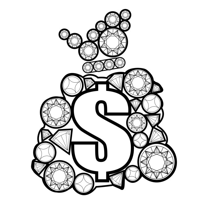
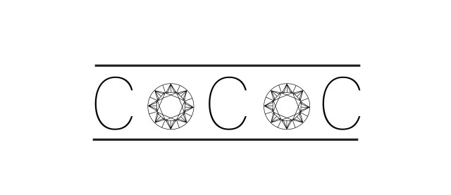
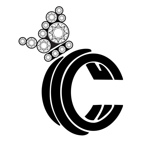

Currency Collection Clothing (CCC) is a barebone letter mark logo for a new independent clothing company. This client wanted to begin developing their brand identity and expressed the desired outcome and guidelines for their logo by providing a rough draft pencil sketch showing a crown made of all diamonds, resting atop the company’s title abbreviated as “CCC”. Additionally, it was requested by the company to produce a secondary, but original, composition for purposes of logo interchangeability. The alternative logo should complement the overall design concept and be easily recognized as an association of the parent brand CCC.
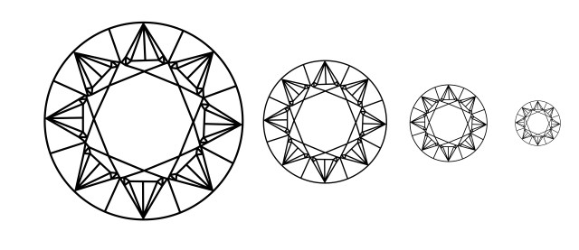
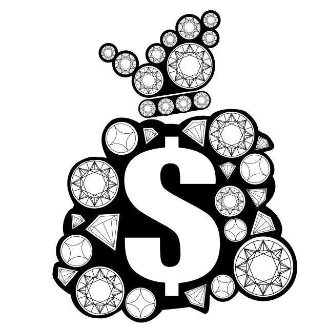
To satisfy the client’s needs, I sketched a cash money bag made up of diamonds in the same style as the crown. This creates ease in brand recognition while also representing the “Currency” aspect of the parent brand’s title. To allow for unlimited combinations of colors and designs during production of the clothing line, I purposefully chose to make the logos black and white. The two pencil sketches were then digitally uploaded and vectorized.
